Relay Coffee Roasters
Work done at Parallel
Branding

Relay, previously known as Red Hill Coffee Roasters, came to our team for a full rebrand since their name no longer reflected their full offerings. The team landed on the name Relay after discovery sessions with the owners of Relay, who we found had a deep respect and love for Hamilton and wanted to invoke the city's history while communicating their passion for quality coffee and engaging the community.

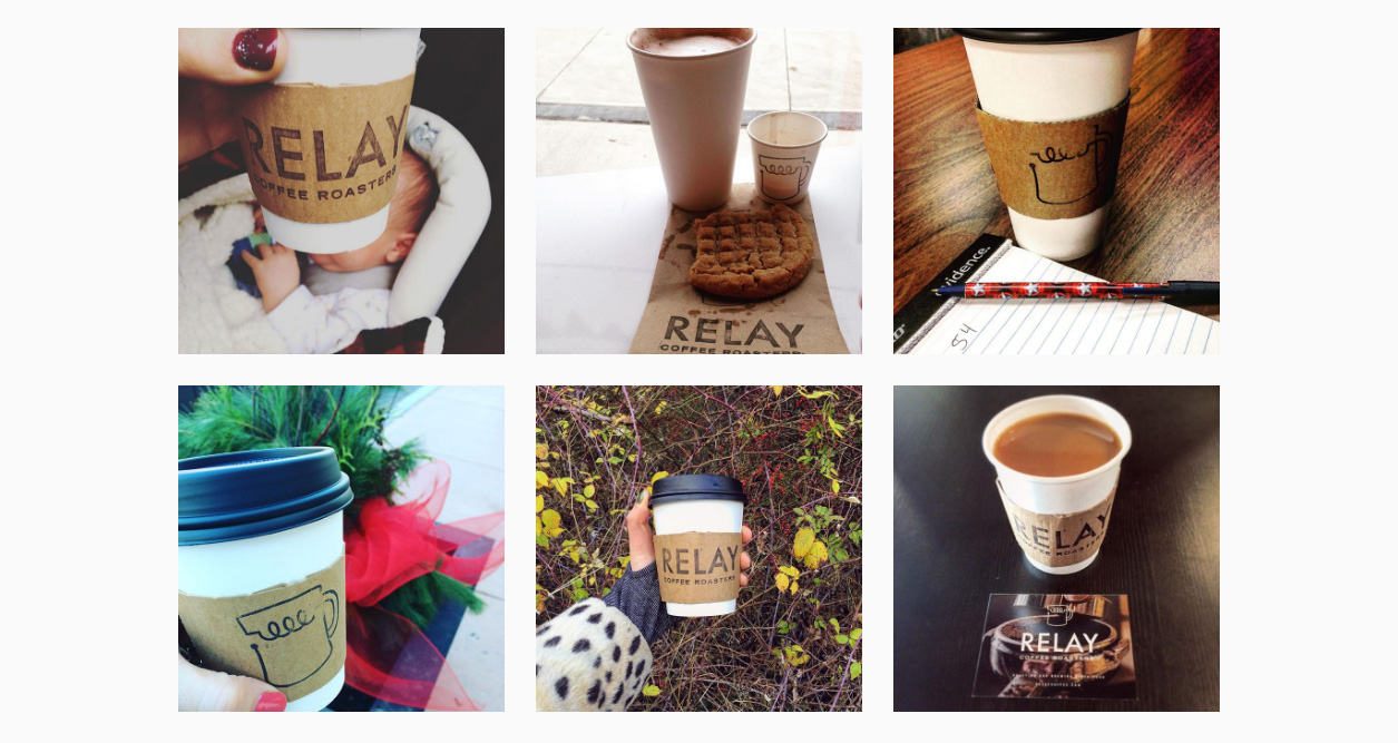
I was briefed in after naming to be a part of a design team developing the brand. I developed the concept of the electrical circuit coffee mug with the stacked, sans-serif type underneath. The icon references the history of Hamilton as "The Electric City" from the naming process, but also invokes the idea of coffee being energizing and also positions Relay as a community connector. After I developed this concept another designer on the team refined it, making subtle tweaks to the shape of the mug and changing the main font from Trade Gothic to Futura.

Jason, one of the owners from Relay, credited the new brand as a crucial component in helping his store not only endure, but grow during a major street repair in front of his newly opened Concession Street cafe. While Jason owes much of that success to his community engagement, it's clear on his social accounts that his customers loved the new brand, taking photos of the cups and packaging at his Concession location.

